
 MVP Profile
 Try my app HoloATC!
  HoloLens 2
 Magic Leap 2
 Meta Quest
 Android phones
 Snap Spectacles
 Buy me a drink ;)
 BlueSky
 Mastodon
 Discord: LocalJoost#3562
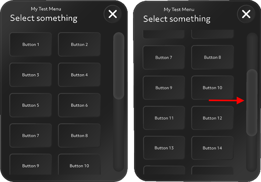
Dynamic data-driven scrollable button menu construction kit for Snap Spectacles part 2 - how it works
In part 1 I described how this component can be used, and I promised to go deeper into the details about how it worked in a follow-up post. This is that post.
The ScrollMenu prefab
I usually build up my prefabs in such a way that the top-level SceneObject has a kind of controller script, while there is always one child SceneObject that holds the actual visible part (in this case, a menu). That way, I can let the controller script handle the actual display state and the way things work by calling a script method, without having to mess with the actual internal structure of the prefab, potentially turning off parts that have vital controlling scripts on it, messing up the workings of the app, and potentially creating issues that way.
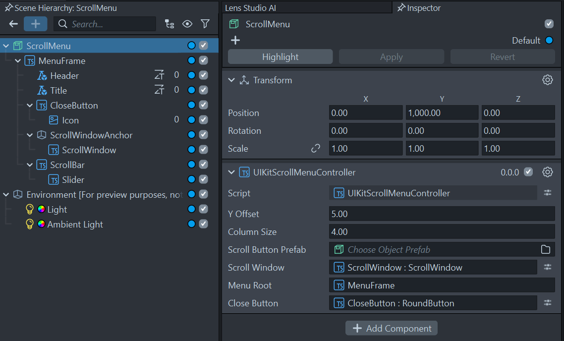
The controller script in this case is called - very originally - UIKitScrollMenuController. It features a few input fields. You can change the first three (in fact, you must do so with the Scroll Button Prefab field after you dragged it onto your scene, as I explained in part 1). The last three should best be left undisturbed.
The first field is the vertical size a button uses (including padding), the second the horizontal size. The control makes buttons in two columns and as many rows as necessary. If you want more columns, you will have to adapt the code. Since you will have to press them by finger, I don’t anticipate much narrower buttons, so I guess you don’t have to change Column Size that often, but Y Offset you might. It is now tailored toward my sample button.
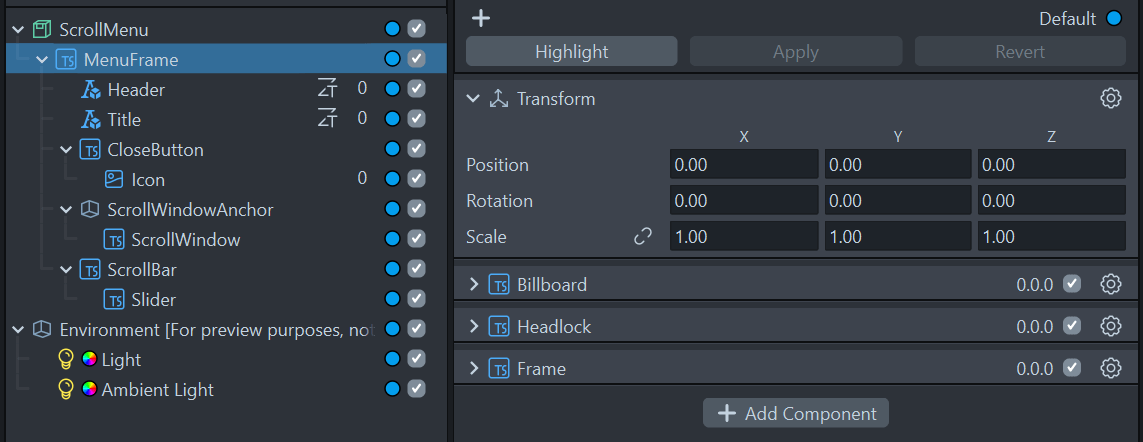
The MenuFrame component contains the Frame script showing the UI canvas, as well as the HeadLock and the Billboard script keeping the UI more or less in view.
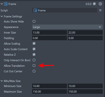
One thing of note - if you are using Billboard, please remember to disable “Allow translation”, otherwise you can still grab and move the floating window, but you will more or less be fighting the HeadLock and the Billboard scripts, which is not desirable. Either the user decides where a window goes, or the system - but not both.
Some other details:
- ScrollWindowAnchor determines where on the floating screen the scroll window will appear. This you can use mostly to decide the vertical starting point, should you require to change that.
- ScrollWindow itself decides the actual size of the scroll area.
- Scrollbar determines the vertical position of the scrollbar.
- Slider determines the size of the scrollbar.
If you change either ScrollWindowAnchor or ScrollWindow, be prepared to fiddle with Scrollbar and ScrollbarSlider until it all fits nicely together again, with sizes aligning visually, etc.
Scripts
The whole thing works using only three custom scripts:
BaseScrollButtonData(which I already explained in the previous post)BaseUIKitScrollButtonControllerUIKitScrollMenuController
So let’s start with the easy part:
BaseUIKitScrollButtonController
This is a fairly simple script, but still requires some explanation. Let’s start with the header and the events.
@component
export class BaseUIKitScrollButtonController extends BaseScriptComponent {
    @input buttonText: Text;
    @input uiKitButton: BaseButton;

    private onButtonPressedEvent = new Event<BaseScrollButtonData>();
    public readonly onButtonPressed = this.onButtonPressedEvent.publicApi();

    public onHoveredEvent = new Event<boolean>();
    public onHovered = this.onHoveredEvent.publicApi();
Remember this can be used as a parent class component for your own button script. Here you can see what it does behind the curtains.
- Text should contain the button’s text to be set by the data fed to this button’s
setButtonDatamethod (as explained before) - It exposes an
onButtonPressedevent that is triggered when the button is pressed, and returns theBaseScrollButtonDatathat was used to create this button in the first place. - It also exposes an event
onHoveredthat tells the interested listener whether the button is hovered over by the user.
Although both events are public, they are typically only used internally, by the UIKitScrollMenuController, as will become clear later.
The setButtonData is used by UIKitScrollMenuController to feed the actual button data to the button that is to be created:
public setButtonData(scrollButtonData: BaseScrollButtonData): void {
    if (this.uiKitButton != null) {
        this.uiKitButton.onHoverEnter.add(() => this.onHoveredEvent.invoke(true));
        this.uiKitButton.onHoverExit.add(() => this.onHoveredEvent.invoke(false));
        this.uiKitButton.onTriggerDown.add(() => this.onButtonPressedEvent.invoke(scrollButtonData));
        this.buttonText.text = scrollButtonData.buttonText;
        this.applyCustomSettings(scrollButtonData);
    }
}

protected applyCustomSettings(scrollButtonData: BaseScrollButtonData): void {
}
It wires up the button’s internal events to the BaseUIKitScrollButtonController’s onButtonPressed and onHovered, both of which will be consumed by the UIKitScrollMenuController. It also sets the button’s text, then finally calls the (here empty) applyCustomSettings method that you can override in a child class should you need to do so, to perform some custom actions for your custom button. I showed an example of that here.
UIKitScrollMenuController
This is basically the magic wand that all ties it together. The start is simple enough:
@component
export class UIKitScrollMenuController extends BaseScriptComponent {
    @input yOffset: number = 5;
    @input columnSize: number = 4;
    @input scrollButtonPrefab: ObjectPrefab;
    @input scrollWindow: ScrollWindow;
    @input menuRoot: SceneObject;
    @input closeButton: BaseButton;

    private onButtonPressedEvent = new Event<BaseScrollButtonData>();
    public readonly onButtonPressed = this.onButtonPressedEvent.publicApi();
    private scrollArea: SceneObject;
On top we see the six inputs already discussed before, then again a onButtonPressed that can inform interested listeners what button in the list was pressed (as shown here). The scrollArea we will need for a peculiar thing later.
Next is the setting up in onAwake:
private onAwake(): void {
    this.scrollArea = this.scrollWindow.getSceneObject();
    this.setMenuVisible(false);
    const delayedEvent = this.createEvent("DelayedCallbackEvent");
    delayedEvent.bind(() => {
        this.initializeUI();
    });
    delayedEvent.reset(0.1);
}
We get a reference to the actual scrollWindow, we hide the menu for now, then start a delayed event for initializing the UI. This is necessary because for some reason the close button is not awake at onAwake yet, so you get the “Component not yet awake” error otherwise.
The methods for initializing the UI, as well as opening and closing the menu are as follows:
protected initializeUI(): void {
    this.closeButton.onTriggerDown.add(() => this.closeMenu());
}

closeMenu() {
    const delayedEvent = this.createEvent("DelayedCallbackEvent");
    delayedEvent.bind(() => {
        this.setMenuVisible(false);
    });
    delayedEvent.reset(0.25);
    this.setMenuVisible(false);
}

public setMenuVisible(visible: boolean): void {
    this.menuRoot.enabled = visible;
}
In the closeMenu I keep a standard 0.25 seconds delay so the ‘click’ sound of the button has time to play; otherwise it will not play or be clipped as menuRoot SceneComponent, that holds all the UI, is hidden. The menuRoot component should be set to the first child in the prefab, as said before:

Otherwise the UIKitScrollMenuController will essentially disable itself.
The meat of the matter is the createButtons method, which essentially creates all buttons and the structure to support events to the outside world. Your own code should call it, feeding it an array of BaseScrollButtonData (or a child class of that). It starts as follows:
public createButtons(scrollButtonData: BaseScrollButtonData[]): void {
    var lines = Math.ceil(scrollButtonData.length / 2);
    var initOffset = lines % 2 != 0 ? this.yOffset : this.yOffset / 2;
    var yStart = Math.ceil(lines / 2) * this.yOffset - initOffset;
    var line = 0;
    this.scrollWindow.onInitialized.add(() => {
        this.scrollWindow.setScrollDimensions(new vec2(0, lines * this.yOffset));
    });
    this.setMenuVisible(true);
It first calculates how many rows of buttons are required, then the initial offset from the center, and with that at what y coordinate the buttons need to start (this will be used later). Then the scroll window scroll dimensions is set to the vertical size times the number of lines. Since we are only scrolling vertically, we only need to set the y part of it.
In hindsight I should have called yOffset “rowSize”, but what the heck.
for (let i = 0; i < scrollButtonData.length; i++) {
    var button = this.scrollButtonPrefab.instantiate(this.scrollArea);
    var buttonTransform = button.getTransform();
    var xPos = (i % 2 == 0) ? -this.columnSize : this.columnSize;
    buttonTransform.setLocalPosition(
      new vec3(xPos, yStart - this.yOffset * line, 0.1));
    button.enabled = true;
    if (i % 2 != 0) {
        line++;
    }

    const buttonController =
       getComponent<BaseUIKitScrollButtonController>(button,
                   BaseUIKitScrollButtonController);
    buttonController.setButtonData(scrollButtonData[i]);
    buttonController.onHovered.add((p) => {
        this.scrollWindow.vertical = !p;
    });
    buttonController.onButtonPressed.add((data) =>
       this.onButtonPressedEvent.invoke(data));
}
this.updateScrollPosition();
So, for every entry in scrollButtonData this code:
- Creates a button
- Places it on the left or right side of the list based on whether it’s an odd or even button
- Enables the button
- Increases the line after every two buttons
- Gets a reference to
BaseUIKitScrollButtonController - Feeds the
BaseScrollButtonDataentry to itssetButtonDatamethod - this will hook up the button - Makes sure the window scrolling is disabled when you hover over a button
- Routes a button’s pressed event to the outside so you can listen to all buttons in one place
- And finally calls
updateScrollPosition
The third-to-last thing deserves a bit of explanation. I noticed it was pretty hard to press a button on a scrollable list, especially in not very good lighting conditions, as you tend to accidentally drag/move the list if you just miss the buttons, or the Spectacles camera misses you trying to press it. This makes it a lot more usable.
updateScrollPosition now is also a bit of a hacky thing. Because if you fill up a UIKit scroll list, it tends to set its scroll button halfway down the list. Why that is, I don’t know.
private updateScrollPosition(): void {
    const delayedEvent = this.createEvent("DelayedCallbackEvent");
    delayedEvent.bind(() => {
        this.scrollWindow.scrollPositionNormalized = new vec2(0, 1);
        this.menuRoot.getTransform().setLocalScale(new vec3(1, 1, 1));
    });
    delayedEvent.reset(1);
}
It basically sets the scrollPositionNormalized to 0, 1, which translates to “vertical top scroll position”. 0, 0 is vertical center, 0, -1 is vertical bottom. If you don’t add updateScrollPosition, instead of the desired left screen, you get the right screen.
Conclusion
So that’s kind of it. I do hope it’s useful for you and also gives you some insights into how you can cajole some UIKit elements into the shape you want. There is actually another little helper class in here, but I will deal with that later in yet another blog post.
The demo project is (still) here at GitHub.