A behavior to implement a scroll-into-view panel (for a Facebook-like GUI) on Windows Phone
As promised, this post describes a behavior to scroll parts of a Windows Phone GUI into view, after I first described how you can create such panels by making creative use of scaling. This can also bee seen as part 4 of my animation-trilogy as it is based heavily on the groundwork laid there. Which goes to show creativity cannot me planned;-)
This behavior is also a very versatile, in the sense that can be used to move any GUI element from any location to another, but I use it now to make a scroll-into-view panel.
Setup
 I started out with the final sample of my previous post. Then I changed a few minor things:
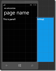
- I selected the MessagePanel1 and changed the Colum to 0 and the Columnspan to 2.
- I selected the Grid below MessagePanel and gave it a blue solid color background brush
- Set the width to 228 (it is now set to 228 (Auto), fill in a hard coded value).
- I selected the Textblock below the grid and changed the text “This is Panel 2” to “Settings”
Net result is displayed to the right.
First, a little refactoring
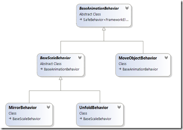
 In the first part of my animation behavior series I created a base class called BaseScaleBehavior. Turned out that was a great base for not only scaling animations, but also other kinds of animations – provided I got rid of a few things. So I created a new base class BaseAnimationBehavior – with basically all the data from BaseScaleBehavior, excluding the Direction, and made BaseScaleBehavior descend from that. Visual Studio (that is, if you have right version) generates this nice diagram for it:
On top we see the new BaseAnimationbehavior, with it’s child class BaseScaleBehavior. This now inherits all properties from BaseAnimationbehavior so as far as the existing behaviors are concerned, nothing has changed. But on the right side there is now room for the new MoveObjectbehavior
The behavior itself
BaseAnimationbehavior has only two properties left that you can set – Duration (the time the effect should take) and “Activate” – a boolean that indicates if the effect should be visible (true) or not. Any descending behavior should implement BuildTransform (to create the Transform for the current state) and BuildStoryBoard (to create a StoryBoard for a transition).
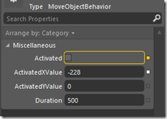
The MirrorBehavior introduces two extra properties that you can set: ActivatedXValue and ActivatedYValue. They are both of type “double?” – that is, nullable double. After all, they need not to be set – if you, like me, want to move only in one direction (horizontal, that is) The behavior assumes at startup that wherever the object it attached to is on the screen now, that’s if default location (for Activated = false). So you need only to supply the new values – and it must me relative values. If you want the screen to move to the left, you should provide a negative value. –228, to be precise – exactly the width of the Settings panel.
The behavior starts rather simple, as it is rather simple – most of the heavy lifting is done by already published code.
using System;
using System.Windows;
using System.Windows.Media;
using System.Windows.Media.Animation;
using Wp7nl.Utilities;

namespace Wp7nl.Behaviors
{
  public class MoveObjectBehavior : BaseAnimationBehavior
  {
    protected override void OnSetup()
    {
      originalTranslation = GetInitialTranslation();
      base.OnSetup();
    }

    private Point originalTranslation;

    private Point GetInitialTranslation()
    {
      return AssociatedObject.GetCompositeTransform() != null ?
        AssociatedObject.GetTranslatePoint() : new Point(0, 0);
    }
  }
}
The behavior starts by checking if there’s a transformation defined and tries to get the translation point from that – in other words, is this object already moved from its place using a translation? If not, then assume a translation of 0.
The BuildTransform of this behavior is pretty simple:
protected override CompositeTransform BuildTransform()
{
  return new CompositeTransform
  {
    TranslateX = Activated && ActivatedXValue != null ?
      ActivatedXValue.Value : originalTranslation.X,
    TranslateY = Activated && ActivatedYValue != null ?
      ActivatedYValue.Value : originalTranslation.Y
  };
}
It sets the X translation to the ActivatedX value if Activated is true and if there is and ActivatedX value defined (it was nullable, remember, so it’s entirely possible it is not – and in all other cases it just uses the original translation value. Repeat for Y.
And the final part of this behavior is a matter of building the Storyboard using the age old AddTranslationAnimation and GetTranslatePoint extension methods that I already wrote back in March 2011
protected override Storyboard BuildStoryBoard()
{
  var storyboard = new Storyboard { FillBehavior = FillBehavior.HoldEnd };
  var transform = BuildTransform();
  var duration = new Duration(TimeSpan.FromMilliseconds(Duration));
  storyboard.AddTranslationAnimation(
    AssociatedObject,
    AssociatedObject.GetTranslatePoint(),
    new Point(transform.TranslateX, transform.TranslateY),
    duration);
  return storyboard;
}
The effect
The effect, if I may say so myself in all modesty, is rather charming. And, by the way, in this little sample solution it’s also ViewModel Driven.
using System.Windows.Input;
using GalaSoft.MvvmLight;
using GalaSoft.MvvmLight.Command;

namespace XamlScale
{
  public class DemoViewModel : ViewModelBase
  {
    private bool showSettings;
    public bool ShowSettings
    {
      get { return showSettings; }
      set
      {
        if (showSettings != value)
        {
          showSettings = value;
          RaisePropertyChanged(() => ShowSettings);
        }
      }
    }
    public ICommand MyCommand
    {
      get
      {
        return new RelayCommand(
            () =>
            {
              ShowSettings = !ShowSettings;
            });
      }
    }
  }
}
 To drive this behavior: simply bind the viewmodels’ MyCommand command to the button with Blend, and the ShowSettings property to the Activated property of the behavior. And then fill in –228 for “ActivatedX”
And that’s all there is to it. The demo solution contains all code displayed in this sample, including the revised behaviors of my earlier series – but they are not really used in the sample.
For the record – I wrote this behavior as part of the 1.1 update of 2 Phone Pong during my holiday, my Surface Pro sitting on the garden table next to our vacation house in Schluchsee in the Schwarzwald (Black Forest), Baden-Wuttenberg, Germany, my wife on next to me reading a book, after a long mountain walk on a beautiful sunny day. While it got slowly dark, we rested from our day’s journey, tea was being consumed, and the typical non-committal carefree talk of a summer holiday evening was going on, this thingy was created. Fond memories. *sigh*.

 MVP Profile
 Try my app HoloATC!
  HoloLens 2
 Magic Leap 2
 Meta Quest
 Android phones
 Snap Spectacles
 Buy me a drink ;)
 BlueSky
 Mastodon
 Discord: LocalJoost#3562