Aligning XAML elements outside the screen using scaling (for a Facebook-like GUI)
This is a trick I use to make partial screens outside of the actual Windows Phone viewport, for instance like the Facebook app for Windows Phone does – that has these ‘side panels’ that slide into view when you tap the “settings” button. Some people like it, some people hate it for being to iOS-y or to Android-y – I just show you how I do it.
This a two part blog post. This first one will show you how the XAML trick is being used an why it works – the second one will cover a behavior for animating the screen.
I start with a standard Windows Phone app and add the following XAML inside the ContentPanel
<Grid x:Name="ContentPanel" Grid.Row="1" Margin="12,0,12,0">
  <Grid.ColumnDefinitions>
    <ColumnDefinition Width="0.5*"/>
    <ColumnDefinition Width="0.5*"/>
  </Grid.ColumnDefinitions>
  <Grid Column="1" x:Name="MessagePanel1">
    <TextBlock Text="This is panel1" FontSize="29.333"></TextBlock>
  </Grid>
  <Grid Column="1" x:Name="MessagePanel2" RenderTransformOrigin="0.5,0.5">
    <TextBlock Text="This is panel2" FontSize="29.333" FontFamily="Andalus"/>
  </Grid>
</Grid>
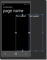
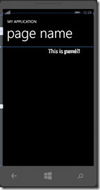 So basically I define a grid that divides my screen vertically in two parts, but both panels are in the same (second column). Now save everything, and open the app in Blend. You will see the following extreme ugly screen as displayed to the right.
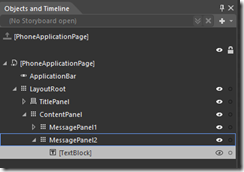
As you can see the two panels are on top of each other. I changed the font of the second panel to illustrate that. Now move over to the Objects and Timeline panel and expand till it looks like this:
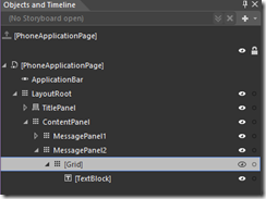 No follow the following procedure:
- Right-click on TextBox,
- Click Group Into
- Select “Grid”
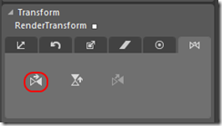 So now we have a grid around the textbox. Select that grid, then go as follows
- With the grid selected, go to the right hand side of the screen and find the “Transform” panel. Expand it if necessary. Selected the “Flip” tab, flip the screen horizontally by clicking the “Flip X-axis” button
- Now go one level up, and select the MessagePanel 2.
- Click the “Flip X-axis” button again.
- And now for the coupe de grace: select Grid again
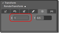
- Select the Center Point tab
- Set X to 1
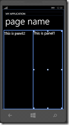 Congratulations. You have probably now found the most complex way to align to two panels together one screen. Why not simply put the Panel2 in a grid column 0? Well… Go back to the transform panel and change the “1” behind X to “-1:
Now you have a screen just outside the screen. Well, almost. Because of the offset of the content panel is 12, you can just about see the leftmost part of panel 2. This is easily fixed (see below)
- Select MessagePanel 2 again.
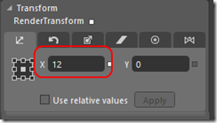
- Go to the Translate Panel again
- Open the “Translate” tab”
- Fill in “12” for Translate X
And done.
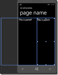 Now if you simply select ContentPanel, click on the Translate X field again and roll down your mouse wheel you will see the the number go below zero and whole screen move to the left, until the whole op panel 2 comes into view (this happens at about –235). Now the only thing we need to do is create an animation that will perform the scrolling. You can do that either in Blend with the Visual State Manager, or with a behavior. I, naturally, choose the latter part. I use both this trick in 2 Phone Pong - not for a settings screen, but to scroll in an advertisement for a more or less secret in-app purchase when the game comes in a certain state (hint – especially when you loose a lot).
By using this double mirroring (actually scaling to “-1”, as a look in the XAML will tell you) and center point trick, things will always outline automatically.
So this was part 1. The demo solution, showing the situation above (and not to the right) shows the situation before the screen is translated to the left. Next time I will show you a behavior that can actually be used to simply automate the animation.
Finally, this trick will work on any XAML platform, not just on Windows Phone. Once again, Blend is your friend. Remember that.

 MVP Profile
 Try my app HoloATC!
  HoloLens 2
 Magic Leap 2
 Meta Quest
 Android phones
 Snap Spectacles
 Buy me a drink ;)
 BlueSky
 Mastodon
 Discord: LocalJoost#3562
