
 MVP Profile
 Try my app HoloATC!
  HoloLens 2
 Magic Leap 2
 Android phones
 Snap Spectacles
 MetaLense 2
 Buy me a drink ;)
 BlueSky
 Mastodon
 Discord: LocalJoost#3562
Migrating to MRKT2 - easily spacing out menu buttons using GridObjectCollection
Intro
This is simple, short but I have to blog it because I discovered this, forgot about it, then discovered it again. So if anything this blog is for informing you as well al to make sure I keep remembering this myself.
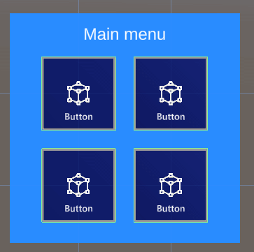
If you have done any UI design for Mixed Reality or HoloLens, you have been in this situation. The initial customer requirement ask for a simple 4 button menu. So you make a neat menu in a 2x2 grid, and are very satisfied with yourself. The next day suddenly you find out you need two more buttons. So - do you make a 2x3 or a 3x2 menu? You decide on the latter, painstakingly arrange them in a nice grid again.
The day after that, there's 2 more buttons. The day after that, 3 more. And the next day... you discover GridObjectCollection. Or in my case, rediscover it.
Simple automatic spacing
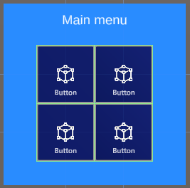
So here is our simple 2x2 menu in the hierarchy. This is a hand menu. It has has a more complex structure than you would imagine, but this is because I am lazy and want an easily adaptable menu that can be organized by GribObjectCollection
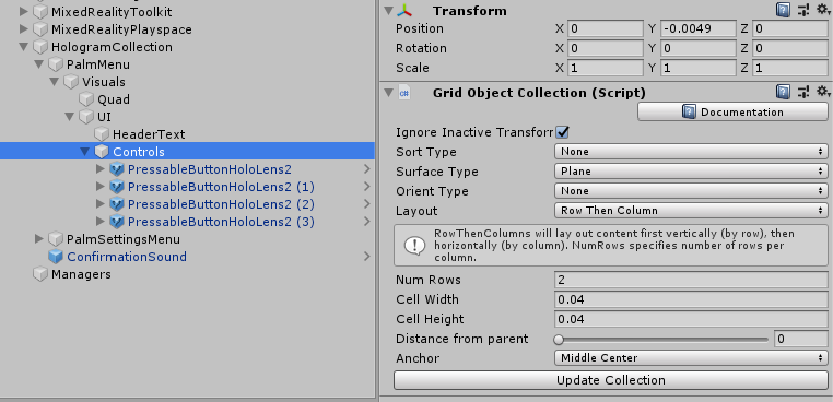
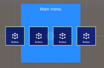
The point is, everything that needs to be easily organizable by GridObjectCollection, needs to be a child of the object that has the actual GridObjectCollection behaviour attached. In my case that's the empty gameobject "Controls". Now Suppose I want this menu not to be 2x2 but 1 x 4. I simply need to change "Num Rows" into 1, press the "Update Collection" button and presto:
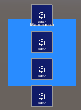
Of course, you will need to update the background plate and move the header text, but that's a lot less work than changing the layout of these buttons. Another example: change the default setting for "Layout" from "Row Then Column" to "Colum then Row", set "Num Rows" to 1 again (for it will flip to 4 when you change the Layout dropdown) and press "Update Collection" again:
You can also change how the button spacing by changing Cell Height and Cell Width. For instance, if I have a 4x4 grid and a cell distance width of 0.032 they are perfectly aligned together without any space in between (not recommended for real live scenario's where you are supposed to press these buttons - a mistake is easily made this way)
You can also do fun things like having then sorted out by name, child order, and both reversed. Or have them spaced out on not only a flat surface, but on a Cylinder, Sphere or a Radial area.
Note: the UpdateCollection can also be accessed by code, so you can actually use this script runtime as well. I mainly use it for static layouts.
Conclusion
Don't waste time in manual spacing, use this very handy tool in the editor to make a nice an evenly spaced button menu - or for whatever you need to have laid out.
Note:
- Make it yourself easy by putting any parts of an UI that should be in a grid in a separate empty game object and put the GridObjectCollection control on that, and place the other parts outside that, so they won't interfere with the layout process.
- You can use this behaviour with any type of game object, not only buttons of course
- More details about GridObjectCollection can be found on the documentation page on GitHub. This also handles related behaviours like ScatterObjectCollection and TileObjectCollection.
No code so no project, although in the next blog post this technique will be applied 'in real life', so to speak.