Putting multiple elements in a Silverlight 3 DataForm DataField while retaining auto Label and Description generation
- Name your DataField
- Add an ItemsControl as wrapping element inside the DataField
- Bind the property to the ItemsControl
- Bind the property of your controls inside the ItemsControl to the ItemsControls' DataContext
using System;
using System.ComponentModel.DataAnnotations;

namespace DataFormDemo
{
  public class Coordinate
  {
    private double _xmin;
    public double XMin { get { return _xmin; } }

    private double _ymin;
    public double YMin { get { return _ymin; } }

    private double _xmax;
    public double XMax { get { return _xmax; } }

    private double _ymax;
    public double YMax { get { return _ymax; } }

    public Coordinate(double x, double y,
                      double xLow, double yLow,
                      double xHigh, double yHigh)
    {
      _x = x;
      _y = y;
      _xmax =  xHigh;
      _ymax =  yHigh;
      _xmin =  xLow;
      _ymin =  yLow;
    }

    private double _x;
    [Display(Name = "X Coordinate:",
      Description = "The X coordinate of the point")]
    public double X
    {
      get
      {
        return _x;
      }
      set
      {
        ValidateValue(value, XMin, XMax);
        _x = value;
      }
    }

    private double _y;
    [Display(Name = "Y Coordinate:",
      Description = "The Y coordinate of the point")]
    public double Y
    {
      get
      {
        return _y;
      }
      set
      {
        ValidateValue(value, YMin, YMax);
        _y = value;
      }
    }

    private void ValidateValue(double value,
     double minValue, double maxValue)
    {
      if (value < minValue || value > maxValue)
      {
        throw new ArgumentException(
            string.Format("Valid value {0} - {1}", minValue,maxValue));
      }
    }
  }
}
and just like Mike did, I added some labels and descriptions (in red) to get a nicer looking form. The purpose of this class is that a user can enter an X and Y value that fall in a range, which is validated. All parameters are set by the constructor.
Then I made some minimal XAML<UserControl x:Class="DataFormDemo.MainPage"
xmlns="http://schemas.microsoft.com/winfx/2006/xaml/presentation"
xmlns:x="http://schemas.microsoft.com/winfx/2006/xaml"
xmlns:d="http://schemas.microsoft.com/expression/blend/2008"
xmlns:mc="http://schemas.openxmlformats.org/markup-compatibility/2006"
xmlns:dataFormToolkit="clr-namespace:System.Windows.Controls;assembly=System.Windows.Controls.Data.DataForm.Toolkit"
mc:Ignorable="d" d:DesignWidth="640" d:DesignHeight="480">
<Grid x:Name="LayoutRoot">
<dataFormToolkit:DataForm x:Name="MyForm"
HorizontalAlignment="Center" VerticalAlignment="Top">
</dataFormToolkit:DataForm>
</Grid>
</UserControl>Then I bound a Coordinate in the constructorpublic MainPage()
{
InitializeComponent();
MyForm.CurrentItem = new Coordinate(
150000, 450000,
0, 300000,
300000, 600000);
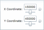
} and got the screen left, with a wee bit more than I bargained for. I was planning to customize the default dataform layout anyway, so I changed the DataForm to:
<dataFormToolkit:DataForm x:Name="MyForm"
  HorizontalAlignment="Center" VerticalAlignment="Top">
  <dataFormToolkit:DataForm.EditTemplate>
    <DataTemplate>
      <StackPanel>
        <dataFormToolkit:DataField >
          <TextBox Text="{Binding X,Mode=TwoWay}"/>
        </dataFormToolkit:DataField>
        <dataFormToolkit:DataField >
          <TextBox Text="{Binding Y,Mode=TwoWay}"/>
        </dataFormToolkit:DataField>
      </StackPanel>
    </DataTemplate>
  </dataFormToolkit:DataForm.EditTemplate>
</dataFormToolkit:DataForm>
That worked out nicely, but wanting to make this a little more slickey and user friendly I introduced a slider connected to the text box with the new Silverlight 3 component-to-component binding:
<dataFormToolkit:DataForm x:Name="MyForm"
  HorizontalAlignment="Center" VerticalAlignment="Top">
  <dataFormToolkit:DataForm.EditTemplate>
    <DataTemplate>
      <StackPanel>
        <dataFormToolkit:DataField >
          <StackPanel>
            <TextBox x:Name="tbX" Text="{Binding X, Mode=TwoWay}"/>
            <Slider Maximum="{Binding XMax}" Minimum="{Binding XMin}"
              Value="{Binding Text, ElementName=tbX, Mode=TwoWay}"/>
          </StackPanel>
        </dataFormToolkit:DataField>
        <dataFormToolkit:DataField >
          <StackPanel>
            <TextBox x:Name="tbY" Text="{Binding Y, Mode=TwoWay}"/>
            <Slider Maximum="{Binding YMax}" Minimum="{Binding YMin}"
              Value="{Binding Text, ElementName=tbY, Mode=TwoWay}"/>
          </StackPanel>
        </dataFormToolkit:DataField>
      </StackPanel>
    </DataTemplate>
  </dataFormToolkit:DataForm.EditTemplate>
</dataFormToolkit:DataForm>
That works swell, but where are my label and my description? Turns out that the Silverlight 3 DataForm shows label and description if and only if there is one element inside that DataField to which the property is bound. You use a StackPanel or something, and the DataForm seems to loose track of where to put which label and which description, so it does not show them at all. After some experimenting around, I found the following work around using the ItemsControl:
<dataFormToolkit:DataForm x:Name="MyForm"
  HorizontalAlignment="Center" VerticalAlignment="Top">
  <dataFormToolkit:DataForm.EditTemplate>
    <DataTemplate>
      <StackPanel>
        <dataFormToolkit:DataField>
          <ItemsControl x:Name="icX" DataContext="{Binding X,Mode=TwoWay}">
            <StackPanel>
              <TextBox x:Name="tbX"
               Text="{Binding DataContext, ElementName=icX, Mode=TwoWay}"/>
              <Slider Maximum="{Binding XMax}" Minimum="{Binding XMin}"
               Value="{Binding Text, ElementName=tbX, Mode=TwoWay}"/>
            </StackPanel>
          </ItemsControl>
        </dataFormToolkit:DataField>
        <dataFormToolkit:DataField >
          <ItemsControl x:Name="icY" DataContext="{Binding Y,Mode=TwoWay}">
            <StackPanel>
              <TextBox x:Name="tbY"
               Text="{Binding DataContext, ElementName=icY, Mode=TwoWay}"/>
              <Slider Maximum="{Binding YMax}" Minimum="{Binding YMin}"
                Value="{Binding Text, ElementName=tbY, Mode=TwoWay}"/>
            </StackPanel>
          </ItemsControl>
        </dataFormToolkit:DataField>
      </StackPanel>
    </DataTemplate>
  </dataFormToolkit:DataForm.EditTemplate>
</dataFormToolkit:DataForm>
But now my sliders do not work anymore: they are locked in the right position. This is logical, because the DataContext of anything inside the ItemsControl is now no longer the Coordinate object, but its X or Y property. So XMin, XMax, YMin and YMax are now unknown (and thus zero). This, too, can be solved by naming your DataFields, using the Path binding syntax and then once again using control-to-control binding:<dataFormToolkit:DataForm x:Name="MyForm"
HorizontalAlignment="Center" VerticalAlignment="Top">
<dataFormToolkit:DataForm.EditTemplate>
<DataTemplate>
<StackPanel>
<dataFormToolkit:DataField x:Name="dfX">
<ItemsControl x:Name="icX" DataContext="{Binding X,Mode=TwoWay}">
<StackPanel>
<TextBox x:Name="tbX"
Text="{Binding DataContext, ElementName=icX, Mode=TwoWay}"/>
<Slider
Maximum="{Binding Path=DataContext.XMax,ElementName=dfX}"
Minimum="{Binding Path=DataContext.XMin,ElementName=dfX}"
Value="{Binding Text, ElementName=tbX, Mode=TwoWay}"/>
</StackPanel>
</ItemsControl>
</dataFormToolkit:DataField>
<dataFormToolkit:DataField x:Name="dfY">
<ItemsControl x:Name="icY" DataContext="{Binding Y,Mode=TwoWay}">
<StackPanel>
<TextBox x:Name="tbY"
Text="{Binding DataContext, ElementName=icY, Mode=TwoWay}"/>
<Slider
Maximum="{Binding Path=DataContext.YMax,ElementName=dfY}"
Minimum="{Binding Path=DataContext.YMin,ElementName=dfY}"
Value="{Binding Text, ElementName=tbY, Mode=TwoWay}"/>
</StackPanel>
</ItemsControl>
</dataFormToolkit:DataField>
</StackPanel>
</DataTemplate>
</dataFormToolkit:DataForm.EditTemplate>
</dataFormToolkit:DataForm> Which gives the resulting - and fully functional - screen to the right. A prime example of something that started out so simple, and then became just a teeny bit more complex ;-)
So, using the ItemsControl and control-to-control binding makes the DataForm retain its ability to generate Labels and Descriptions automatically. Which shows that Silverlight 3 databinding is about as flexible as a rubber band.
One note of caution: when binding Maximum, Minimum and Value to a slider, this must be done in exactly the right order, as shown here. I blogged about this earlier this week.

 MVP Profile
 Try my app HoloATC!
  HoloLens 2
 Magic Leap 2
 Meta Quest
 Android phones
 Snap Spectacles
 Buy me a drink ;)
 BlueSky
 Mastodon
 Discord: LocalJoost#3562