Templating a XAML CheckBox to a thumbs-up/down control using Expression Blend
The checkbox has been been around in the Graphical User Interface for as long as I can remember doing GUI – since the early 90’s I guess. You know what, let’s make that “it’s been around for longer than I care to remember” ;). For my newest Windows Phone project I wanted something different. In stead of boring old
I wanted something like this:
Turns out you can do this in pure XAML. And almost entirely in Expression Blend, too. I could just post the XAML and be done with it, but I like to document the track I took, not only to educate you, but also to remember myself how the hell I got here in the first place ;-).
Setting the stage
- Open Visual Studio 2010
- Create a new Windows Phone 7 (7.1 of course!) project,
- Make a folder “icons”

- Download this image to your computer
- Paste it in the “icons” folder in Visual Studio
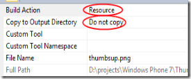
- Double check the image’s properties, they should be as showed to the right.
- Save the project
- Open the project in Expression blend
- Put one (or more, for all I care) CheckBoxes on the phone page.
- Select one of them, then click in the main Blend menu “Object/Edit Style/Create Empty”.
- In the dialog that follows, enter “Thumbupdowncheckboxstyle” for a name and select “Application” under “Define in”
- You will get a screen with a single CheckBox. Right click it, select “Edit template/Create Empty”.
- In the dialog that follows, enter “Thumbupdowncheckboxtemplate” for a name and select “Application” under “Define in”
- Delete the Grid
- Add a Rectangle to the template by double clicking on the Rectangle button from the Assets toolbar on the left
<Application.Resources>

  <ControlTemplate x:Key="Thumbupdowncheckboxtemplate" TargetType="CheckBox">
    <Rectangle Fill="#FFF4F4F5" Stroke="Black"/>
  </ControlTemplate>

  <Style x:Key="Thumbupdowncheckboxstyle" TargetType="CheckBox">
    <Setter Property="Template" Value="{StaticResource Thumbupdowncheckboxtemplate}"/>
  </Style>

</Application.Resources>
And the design surface will only show a horizontal white rectangle with a black border.Default control size
 First and foremost, set the default size of your control. To get this done, look right top, select the Resources tab and expand App.Xaml. Then proceed as follows:
- Right-click Thumbupdowncheckboxstyle
- Select “Edit”
- Select the “Properties” tab left of the “Resources” tab
- Locate the “Width” and “Height” fields and enter 40 for both.
<Application.Resources>

  <ControlTemplate x:Key="Thumbupdowncheckboxtemplate" TargetType="CheckBox">
    <Rectangle Fill="#FFF4F4F5" Stroke="Black"/>
  </ControlTemplate>

  <Style x:Key="Thumbupdowncheckboxstyle" TargetType="CheckBox">
    <Setter Property="Template" Value="{StaticResource Thumbupdowncheckboxtemplate}"/>
    <Setter Property="Width" Value="40"/>
    <Setter Property="Height" Value="40"/>
  </Style>

</Application.Resources>
Propagate default size to template Now go back to editing the Control template again:
- Once again go to the “Resources” tab left top
- Right-click Thumbupdowncheckboxtemplate
- Select “Edit”.
- Select the Rectangle and Click the tab “Properties” top left again

- Click the little square all the way to the right behind the field “Width”
- This will popup a menu. Select “Template Binding/Width”
- Click the little square behind “Height” and Select “Template Binding/Height”
<Application.Resources>

  <ControlTemplate x:Key="Thumbupdowncheckboxtemplate" TargetType="CheckBox">
    <Rectangle Fill="#FFF4F4F5" Stroke="Black" Width="{TemplateBinding Width}"
    Height="{TemplateBinding Height}"/>
  </ControlTemplate>

  <Style x:Key="Thumbupdowncheckboxstyle" TargetType="CheckBox">
    <Setter Property="Template" Value="{StaticResource Thumbupdowncheckboxtemplate}"/>
    <Setter Property="Width" Value="40"/>
    <Setter Property="Height" Value="40"/>
  </Style>

</Application.Resources>
Initial colorsNext steps:
 Click the white white rectangle behind “Fill”
- Don’t bother to select a color: simply type in “Green” in the text box and Blend will make a pretty hex string of it ;-)
- After that, click the little white square behind “Stroke”
- From the popup-menu, select “Reset”
<Application.Resources>

  <ControlTemplate x:Key="Thumbupdowncheckboxtemplate" TargetType="CheckBox">
    <Rectangle Fill="Green" Width="{TemplateBinding Width}" Height="{TemplateBinding Height}"/>
  </ControlTemplate>

  <Style x:Key="Thumbupdowncheckboxstyle" TargetType="CheckBox">
    <Setter Property="Template" Value="{StaticResource Thumbupdowncheckboxtemplate}"/>
    <Setter Property="Width" Value="40"/>
    <Setter Property="Height" Value="40"/>
  </Style>

</Application.Resources>
Including the image as an ‘opacity mask’ Blend’s greatest asset – it’s enormous capabilities – unfortunately is also sometimes its Achilles’ heel: there’s a bewildering set of options that’s not always easy to find your way in. Fortunately, at the top of the Properties there’s a Search box that helps you find that hard-to-find-options. Which is extremely helpful – if you happen to know what to look for ;-). In this case:
 - Enter “Opacity” in the Search box
- Click “No Brush”
- Select “Tile Brush” – that’s the 2nd icon from the left
- That produces a drop-down where you can select “icons/thumbsup.png”
<Application.Resources>

  <ControlTemplate x:Key="Thumbupdowncheckboxtemplate" TargetType="CheckBox">
  <Rectangle Fill="Green" Width="{TemplateBinding Width}" Height="{TemplateBinding Height}">
    <Rectangle.OpacityMask>
    <ImageBrush Stretch="Fill" ImageSource="icons/thumbsup.png"/>
    </Rectangle.OpacityMask>
  </Rectangle>
  </ControlTemplate>

  <Style x:Key="Thumbupdowncheckboxstyle" TargetType="CheckBox">
  <Setter Property="Template" Value="{StaticResource Thumbupdowncheckboxtemplate}"/>
  <Setter Property="Width" Value="40"/>
  <Setter Property="Height" Value="40"/>
  </Style>

</Application.Resources>

 Your design surface should now looks like to the image to the left, which is kinda crummy. You can use the little triangle on the right bottom, and the two little lines on the right and the bottom, to resize the design surface. This will have no effect on the control template itself, it will make just make it look better (see right image) .
 You can also manually add the attributes d:DesignWidth="75" and d:DesignHeight="75" to the Rectangle.
Defining Visual States
 A CheckBox has certain states, the most obvious being Checked and Unchecked. Actually there are quite a lot more, and you can see them by clicking on the “States” tab. Now all these states are defined, but there are no visuals connected to it anymore, since you have replaced the control template by something empty and started filling in yourself. This next step will bring a bit of those visual states back. To prepare for that:
- Make sure the Rectangle is selected in the “Objects and Timeline” panel left
- In the Properties panel to the right of the screen, scroll down to “Transform”
- Expand the Transform panel if it’s collapsed
- Selected the leftmost tab
- Enter 0.5 in both X and Y boxes
 XAML at this point:
<Application.Resources>

  <ControlTemplate x:Key="Thumbupdowncheckboxtemplate" TargetType="CheckBox">
    <Rectangle Fill="Green" Width="{TemplateBinding Width}" Height="{TemplateBinding Height}"
       d:DesignWidth="75" d:DesignHeight="75" RenderTransformOrigin="0.5,0.5">
      <Rectangle.RenderTransform>
        <CompositeTransform TranslateX="0.5" TranslateY="0.5"/>
      </Rectangle.RenderTransform>
      <Rectangle.OpacityMask>
        <ImageBrush Stretch="Fill" ImageSource="icons/thumbsup.png"/>
      </Rectangle.OpacityMask>
    </Rectangle>
  </ControlTemplate>

  <Style x:Key="Thumbupdowncheckboxstyle" TargetType="CheckBox">
    <Setter Property="Template" Value="{StaticResource Thumbupdowncheckboxtemplate}"/>
    <Setter Property="Width" Value="40"/>
    <Setter Property="Height" Value="40"/>
  </Style>

</Application.Resources>
In the “States” panel, click on the “Checked” state. This will add quite some XAML code: you will see a “VisualStateManager.VisualStateGroups” tag appear, defining all three states of the “CheckStates” group, i.e. “Checked”, “Unchecked” and “Indeterminate”. - Now Select the “Unchecked” state
- Make sure the “Rectangle” still is selected in the “Objects and Timeline” panel
- Select the “Properties” tab on the top right again
- Select the (now green) “Fill” Rectangle again.
- In the box where you previously typed “Green” (which will say ”#FF008000” now), type “Red”. The thumbs-up image will now turn red
 Scroll down to “Transform” again
- Select the right most tab
- Select the “Flip Y-axis” button, in the middle. The thumbs-up image will now flip vertically and turn into a thumbs-down picture.
 Locate the little red button on top of the design pane that says “Unchecked state recording is on”. Click it and the text should change into “Unchecked state recording is off”.
Now, for a finale to make things a little more visually appealing:
 Go back to the “States” tab again
- Select the Textbox with “0 s” in the “Default transition” panel above state “Unchecked”
- Type 0.5 in the text box
- And press F5 again.
Final XAML:
<Application.Resources>

  <ControlTemplate x:Key="Thumbupdowncheckboxtemplate" TargetType="CheckBox">
    <Rectangle x:Name="rectangle" Fill="Green" Width="{TemplateBinding Width}"
               Height="{TemplateBinding Height}"
               d:DesignWidth="75" d:DesignHeight="75" RenderTransformOrigin="0.5,0.5">
      <Rectangle.RenderTransform>
        <CompositeTransform TranslateX="0.5" TranslateY="0.5"/>
      </Rectangle.RenderTransform>
      <Rectangle.OpacityMask>
        <ImageBrush Stretch="Fill" ImageSource="icons/thumbsup.png"/>
      </Rectangle.OpacityMask>
      <VisualStateManager.VisualStateGroups>
        <VisualStateGroup x:Name="CheckStates">
          <VisualStateGroup.Transitions>
            <VisualTransition GeneratedDuration="0:0:0.5"/>
          </VisualStateGroup.Transitions>
          <VisualState x:Name="Indeterminate"/>
          <VisualState x:Name="Unchecked">
            <Storyboard>
              <DoubleAnimation Duration="0" To="-1"
                    Storyboard.TargetProperty="(UIElement.RenderTransform).(CompositeTransform.ScaleY)"
                    Storyboard.TargetName="rectangle" d:IsOptimized="True"/>
              <ColorAnimation Duration="0" To="Red"
                   Storyboard.TargetProperty="(Shape.Fill).(SolidColorBrush.Color)"
                   Storyboard.TargetName="rectangle" d:IsOptimized="True"/>
            </Storyboard>
          </VisualState>
          <VisualState x:Name="Checked"/>
        </VisualStateGroup>
      </VisualStateManager.VisualStateGroups>
    </Rectangle>
  </ControlTemplate>

  <Style x:Key="Thumbupdowncheckboxstyle" TargetType="CheckBox">
    <Setter Property="Template" Value="{StaticResource Thumbupdowncheckboxtemplate}"/>
    <Setter Property="Width" Value="40"/>
    <Setter Property="Height" Value="40"/>
  </Style>
</Application.Resources>
You could of course go on and define all other states, but this already works pretty well IMHO ;-). Oh and by the way: this should work on any XAML platform, not just on Windows Phone. And for those who don’t like typing or copy-and-pasting, here is, as always, the complete demo solution.Thanks to Willem Meints for helping me out via twitter on default setters for styles.

 MVP Profile
 Try my app HoloATC!
  HoloLens 2
 Magic Leap 2
 Meta Quest
 Android phones
 Snap Spectacles
 Buy me a drink ;)
 BlueSky
 Mastodon
 Discord: LocalJoost#3562