ViewModel driven multi-state animations using DataTriggers and Blend on Windows Phone
Long long time ago I wrote how to drive animations from your ViewModel using DataStateBehavior, and I explicitly stated this was the only way to do it, since (quoting myself), “Windows Phone 7 does not support DataTriggers”. That was then, and this is now. The drawback of DataStateBehavior is that you basically can only do on/off animations, which makes more complex multi-state animations impossible. There was another behavior that could do that, but I could not find that anymore and I could not quite remember the name. And then I suddenly stumbled upon the Microsoft.Expression.Interactions assembly – and in its Microsoft.Expression.Interactions.Core namespace there is indeed a DataTrigger. And that seems to have been present in the 7.1 framework as well. *Cough*.
So in this blog post I am going to demonstrate how to animate a few ‘popup windows’ via a single Visual State block and a ViewModel, using DataTriggers. I am going to show this using Visual Studio 2012, MVVMLight and mostly Blend. It’s time to give this unsung hero some love again, so I am going to follow the tutorial-style again.
- Open Visual Studio, create a “Windows Phone app”, and target 8.0 (it should work in 7.1 as well BTW)
- Click Tools/Library Package Manager/Manage NuGet Packages for Solution.
- Search for MvvmLightLibs, select “MVVM Light Libraries only”
- Click “Install”, “Ok” and “I Accept”
Building the ViewModel
The ViewModel actually consist out of two files – an enumeration describing the states and the actual ViewModel itself. First, create a folder “ViewModel” in your solution, and the create the enumeration like this:
namespace DataTriggerAnimation.ViewModel
{
  public enum DisplayState
  {
    Normal = 0,
    ShowPopupHello = 1,
    ShowPopupBye = 2,
  }
}
And then the ViewModel like this:
using System;
using System.Windows.Input;
using GalaSoft.MvvmLight;
using GalaSoft.MvvmLight.Command;

namespace DataTriggerAnimation.ViewModel
{
  public class DisplayViewModel : ViewModelBase
  {
    private DisplayState displayState;
    public DisplayState DisplayState
    {
      get { return displayState; }
      set
      {
        if (displayState != value)
        {
          displayState = value;
          RaisePropertyChanged(() => DisplayState);
        }
      }
    }

    public ICommand DisplayPopupCommand
    {
      get
      {
        return new RelayCommand<string>(
            (p) =>
              {
                DisplayState = (DisplayState)Enum.Parse(typeof(DisplayState), p);
              });
      }
    }

    public ICommand CloseCommand
    {
      get
      {
        return new RelayCommand(()
           => DisplayState = DisplayState.Normal);
      }
    }
  }
}
The important thing to note is that the command “DisplayPopupCommand” requires a parameter to determine the popup that must be displayed. The CloseCommand is equivalent to a DisplayPopupCommand with parameter “Normal”, and is just there for making the designer’s life easier.
… and that’s all the coding we are going to do. Build your application and close Visual Studio. The rest, just like my last animation post is done in Blend! All of it.
Creating the first panel
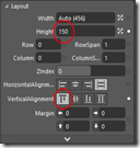 Drag a grid on the empty rectangle “ContentPanel”. Like all GUI objects, these can be found on the Assets tab on the left top.
- Click on the “Grid” in the “Objects on Timeline” pane left, and rename it to “Panel1”
- Right-click on the “Panel1” grid, hit ‘Reset Layout/All”
- Go to the right-hand pane, select “Properties” and expand the “Layout” pane if it’s collapsed.
- Then click “Top” for Vertical Alignment.
- Then enter “150” for height
Then proceed to add a text:
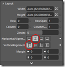 Drag a TextBlock on the “Panel1” grid. You can do this by either dragging it on the design surface on top of “Panel1”, or on the “Objects and Timeline” pane (also on top of “Panel1”)
- Change the text from “TextBlock” to “Hello this is popup one”
- Do Reset Layout/All on this text as well
- In the Layout Pane, select Horizontal Alignment “Center” and Vertical Alignment “Top”
And finally add a button:
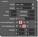 Drag a button on Panel1
- Do Reset Layout/All on this button as well
- Change the caption to “Done”
- In the Layout Pane, select Horizontal Alignment “Center” and Vertical Alignment “Bottom”
And then finally do something that seems like pretty bonkers, but trust me: it will all become clear in the end:
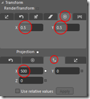 Select Panel1 in the Objects and Timeline panel.
- Go to the Properties pane on the right hand side, and find the “Transform” pane. It’s usually collapsed. Expand it first.
- Select Center Point tab - the 2nd tab from the right under “Rendertransform” (with the dot on in)
- For both X and Y type “0.5”. This sets the transformation point dead in the middle of the panel
- Then also select the Global offset tab – that’s the 2nd tab from the right under “Projection” (with the up and left pointing arrow on it)
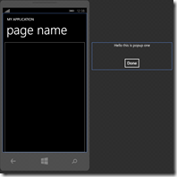 Enter “500” for X.
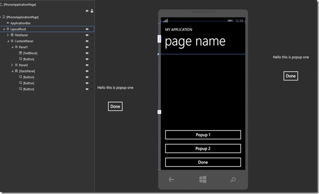
Your design surface now should look like showed on the right. The panel is sitting well right of the phone. Bonkers, I said it. ;-).
Creating the second panel
Going to be a bit lazy here. I don’t want to to the whole sequence again
- Select Panel 1 in “Objects and Timeline”
- Hit CTRL-C, CTRL-V. This will result in a Panel1_Copy below Panel 1
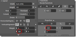 Rename that to “Panel2”
- Go to the Properties tab again on the right, and enter “160” for top margin. This should result in Panel2 appearing under Panel1
- Then, for an encore, go to the Transform panel again and change “500” for X Projection to -500
The second panel should jump to the left and 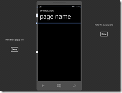 resulting design surface should now look like this:
Creating the popup buttons
At this time I am going to assume you now understand the layout panel, so I am not going to make screenshots of every button you need to click and number you need to enter in the layout panels ;-)
- Drag a StackPanel on the design surface, near the bottom of the screen.
- Do Reset Layout/All,
- Select Vertical Alignment Bottom, and enter a height of 220.
- Proceed to drag three buttons on top of the StackPanel. These should appear under each other, taking the full width of the screen.
- Change the captions of the buttons to (from top to bottom) “Popup 1”, “Popup 2” and “Done”.
The final design surface, including the objects tree, should look like this:
Defining the Visual States
We have three visual states:
- None of the popups are displayed
- Popup 1 is displayed
- Popup 2 is displayed
To create these, proceed as follows:
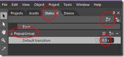 At the top left, click the “States” Tab.
- Click the “Add state Group” Button
- Rename “VisualStateGroup” to "PopupGroup”
- Enter “0.5” for “Default Transition”. This indicates any state transitions will be automatically animated over a 0.5 second time period.
Next steps:
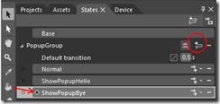 Click the “Add state” Button
- Rename the state “VisualState” to “Normal”
- Add two more states, “ShowPopupHello” and “ShowPopupBye”
- Click the red dot before “ShowPopupBye”. The red color disappears. The main design surface should now have a caption “ShowPopupBye state recording is off”
Now the next things are tricky, so pay close attention and make sure you do this exactly right.
- Select “Panel1” in “Objects and Timeline”
- Click state “ShowPopupHello”. The main design surface should now have a caption “ShowHelloPopupstate recording is on” and have a red border.
- Go to the Transform panel again, select under projection the Global offset (2nd tab from the right) again and change 500 back to 0. Panel 1 should now appear in the phone screen
- Now select state “ShowPopupBye”. Panel 1 disappears again
- Select Panel2
- Change its global offset to 0 as well. Now panel 2 appears in the phone screen
- Select State “Normal”
- Select the red dot before “Normal” to turn state recording off. Both panels now should be outside of the phone screen again.
- Select “Base” on top of the State panel.
Bringing in the ViewModel
Before we are going to connect the Visual States to the ViewModel’s actions, let’s first bring it in. That’s pretty easy.
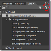 Go top right and select the data tab.
- Select the “Create data source” button all to the right and select “Create object data source”
- On about the 8th line you should see “DisplayViewModel”. Select that
- Enter “DisplayViewModelDataSource” in the “Data source name” box
- Hit OK.
- Net result should be as displayed to the right.
Setting up initial data binding
This is so ridiculously easy in Blend it always makes me happy when I get to this state.
- Drag “DisplayViewModel” from the data tab on top of the LayoutRoot panel in the Objects and Timeline panel
- Drag “CloseCommand” on top of all three “Done” buttons. You can do that either on the design surface or on the Objects and Timeline panel, whatever you like.
- Proceed to drag “PopupCommand” on top of both the “Popup 1” and “Popup 2” button.
- Now select the “Popup 1” button, and select the “Properties” tab again.
- On top there’s a “Search properties” box. The developers of Blend soon recognized the number of things you can set it so big you can easily loose track. Enter “Command” in that search box to limit the number of properties it shows.
- The Properties box now should only show “Command” and “CommandParameter”. Enter value “ShowPopupHello” for “CommandParameter”
- Now select the “Popup 2” button, and enter “ShowPopupBye” for “CommandParameter”
- Clear the text “Command” from “Search Properties” so you can see all the properties again.
Programming by dragging stuff on top of each other. Ain’t life fun sometimes?
 Enter the dragon: datatriggers for putting it all together
And now for the really scary part – the datatriggers. Just kidding of course – just more dragging stuff and filling in some fields. The odd thing is – from the Blend perspective, data triggers are hardly visible. We are using GotoStateActions. Finish the app by following these final steps:
- Drag a GotoStateAction from Assets box on top of ContentPanel. If you can’t find it: type “goto” in the search box of the Asset panel. It will popup in the list to the right of the panel
- Under Properties, Click on the “New” button next to “TriggerType” and select “DataTrigger” in the box that pops up.
- Behind “Binding”, click the barrel like icon. A dialog pops up with the properties of your DisplayViewModel. Select “DisplayState” and hit OK
- Enter “0” for value
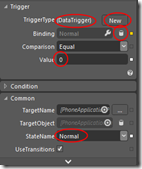 For StateName, select “Normal”
- Drag another GotoStateAction from Assets box on top of ContentPanel. Make this a DataTrigger to, select the same property to bind to, but
- Enter “1” for “Value”
- Select “ShowPopupHello” for StateName
- And finally, a third GotoStateAction with 2 as value and “ShowPopupBye” for StateName.
And that’s all. If you run your application (you should be able to hit F5 from Blend) you will get a simple app that scrolls Popup 1 from the left in half a second when you hit “Popup 1”, and scroll it back when you hit on of the done buttons. If you hit the “Popup 2” button when Popup 1 is visible, it will scroll the second popup into the screen while simultaneously scrolling the first on out of the screen.
The data triggers look like this in XAML:
<i:Interaction.Triggers>
  <ec:DataTrigger Binding="{Binding DisplayState}" Value="0">
    <ec:GoToStateAction StateName="Normal"/>
  </ec:DataTrigger>
  <ec:DataTrigger Binding="{Binding DisplayState}" Value="1">
    <ec:GoToStateAction StateName="ShowPopupHello"/>
  </ec:DataTrigger>
  <ec:DataTrigger Binding="{Binding DisplayState}" Value="2">
    <ec:GoToStateAction StateName="ShowPopupBye"/>
  </ec:DataTrigger>
</i:Interaction.Triggers>
Some things to note
- We hardly did program anything at all, and what’s more – we did not even make animations or storyboards. By simply setting the default transition to 0.5 seconds and indicating where we want stuff to be once a state is reached, the Windows Phone framework automatically infers and creates an animation when changing state, moving the GUI elements from one place to another in half a second (in stead of flashing them from one place to another).
- In the Command I was able to use names as defined in the enumeration because I did an Enum.Parse in the ViewModel, in the data triggers I had to use the real value (0,1,2) to be able to compare. Something that can be fixed using a converter, but I did not want to complicate things.
- The fact that the visual state names have the same name as the enumeration values, does not bear any significance. I could have named them Huey, Dewey, and Louie for all I cared. Only the CommandParameter values need to be the same as the Enumeration string, and the DataTriggers need to have the same numeric value.
That’s it. Although the Visual Studio 2012 designer is light years ahead of the 2010 designer, Blend still rocks when defining a lot of stuff in XAML. Have fun making beautifully animated apps with this.
If you don’t feel like following all these steps yourself, find, as usual, the completed solution here.

 MVP Profile
 Try my app HoloATC!
  HoloLens 2
 Magic Leap 2
 Meta Quest
 Android phones
 Snap Spectacles
 Buy me a drink ;)
 BlueSky
 Mastodon
 Discord: LocalJoost#3562

